Back in November, Don Lampert, our Lead Digital Strategist, warned of Google’s impending mobile-friendly labels and offered advice on how to determine if your own site was up to snuff. Did you take his advice and run your site through Google’s free Mobile-Friendly Test? If so, did your website measure up?
If it didn’t, did you do anything about it?
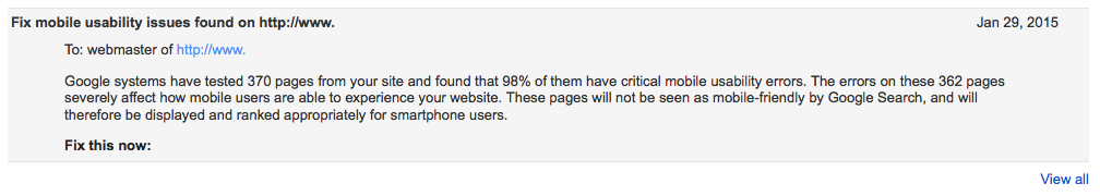
If you either neglected to check your site or figured you’d fix it later, time is running out. Just recently, Google began to send messages to site owners via Webmaster Tools with the subject line “Fix mobility issues found on [website].” The message further explained that Google tested pages from the site and found a majority of them to have critical mobile usability errors.
Google then delivered the equivalent of a mic drop by stating: These pages will not be seen as mobile-friendly by Google Search, and will therefore be displayed and ranked appropriately for smartphone users.
 Mobile & Tablet Users are Here to Stay
Currently, mobile and tablet traffic account for 35.92% of all Internet activity in North America, and that number is only growing. Additionally, a 2014 study sponsored by Google found that 88% of smartphone users and 84% of tablet owners conduct local searches. Do you really think your digital marketing efforts can succeed without catering to mobile and tablet users too?
The short answer is no. The folks at Search Engine Land have been predicting that a new mobile ranking algorithm is in the works and while Google hasn’t confirmed that suspicion, they also haven’t really given us any reason to think otherwise. Last fall, Google’s official Webmaster Central Blog stated, “We are also experimenting with using the mobile-friendly criteria as a ranking signal.” That’s about as straightforward as Google can get, so if they’ve directly advised you to do something, you ought to listen.
Without further ado, here are the four errors you want to avoid to be considered mobile-friendly:
- Touch Elements to Close – Links, forms, and buttons should be spaced out enough that users don’t accidentally click on something they didn’t intend to.
- Viewport Not Configured – Phones, tablets, and even laptops have vastly different screen sizes. If you’re looking for a one-size-fits-all solution, mobile responsive is the way to go. Dedicated mobile and desktop sites no longer get the job done.
- Small Font Size – Pretty self explanatory; no one wants to squint or zoom in 150% to read the content on your site.
- Content Not Sized to Viewport – Scrolling up and down is natural, but scrolling right to left isn’t. Don’t make users scroll horizontally to see the entire width of a page on your site.
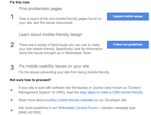
Visit Webmaster Tools support site for more information on their mobile usability criteria, best practices, and possible solutions. If you haven’t logged into your Webmaster Tools account in a while, now would be a good time to check, the message does include tips for how to proceed.
As an added bonus, I’ll leave you with one more mobile-friendly element worth considering – site speed. Not only should your site look good on a phone or tablet, but it should also load fast and work well or users will bounce, and that’s equally unhelpful.
Want one of our experts to audit your website? Contact PCG Digital Marketing’s Web Development Team!
About the Author
Gina Orlando is the Marketing Manager at PCG and is passionate about learning new things and keeping up with the latest marketing, social media, and pop culture trends. In her spare time, she enjoys listening to country music, online shopping, and anything chocolate.