No one is questioning the fact that the future of the world wide web is a mobile one.
Already nearly half of all American adults own a smartphone, a number which will only continue to rise as hundreds of thousands of new Android and Apple phones are purchased each day and more affordable smartphone options continue to hit the market. Maybe even more telling, in the next three years, analysts predict more people will browse the web on their mobile device than on a desktop. Pretty incredible really, considering that the smartphone didn’t exist a little over a decade ago.
What this means is that when people want to learn about your business and to shop for your products, more and more they’re going to do so on a mobile phone.
How do you make sure you’re ready for them?
Well, last month, Google made answering that question a bit easier when it finally shared its stance on mobile web design and announced the three types of smartphone-optimized websites it supports:
- Sites that use responsive web design, i.e. sites that serve all devices on the same set of URLs, with each URL serving the same HTML to all devices and using just CSS to change how the page is rendered on the device.
- Sites that dynamically serve all devices on the same set of URLs, but each URL serves different HTML (and CSS) depending on whether the user-agent is a desktop or a mobile device.
- Sites that have separate mobile and desktop URLs.
So, if you’re making use of one of these options to present your website content to mobile visitors, you’re in good shape.
Responsive Web Design
With responsive web design, the layout and dimensions of a site will adapt to best suit the device being used.
To accomplish this, a responsive design makes use of CSS Media Queries. A media query will set certain parameters — usually minimum and maximum widths — and serve up CSS style rules only to devices with those same attributes. With media queries and a bit off CSS in place, elements of your layout will resize and reposition themselves to make for a better mobile experience.
Here’s code that would link to an entirely different CSS stylesheet for devices with screens under 480px wide.
<link rel=“stylesheet” type=“text/css” media=“only screen and (max-device-width: 480px)” href=“mobile.css” />
You can also add media queries to your existing stylesheets themselves using something like this:
@media only screen and (max-device-width: 480px) {
/*CSS Style Rules Go Here*/
}
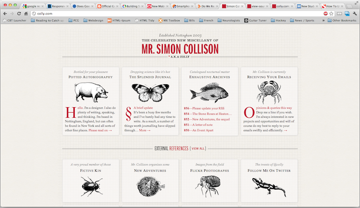
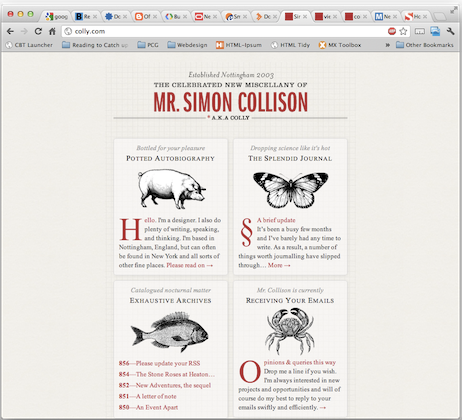
One of the best and oft-cited examples of responsive web design at work is the website of designer Simon Collison: http://www.colly.com.
Open the site with your browser window as wide as it will go. Then progressively make the window smaller. When you hit certain widths, you’ll see quite clearly what media queries are capable of doing.


Dynamically Served Content
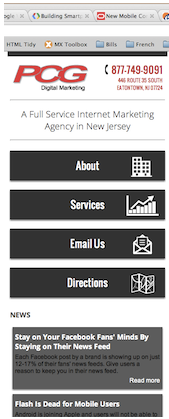
At PCG Digital Marketing, we use dynamically served content to cater to our mobile visitors. With this method, a PHP script on our website detects which device a visitor is using based on that visitor’s user agent, which in simpler terms, is their browser. If the script determines a visitor is on a desktop browser, it serves them the full version of our website.

If it finds the user agent of a mobile browser, visitors instead see a simpler, more-mobile-friendly version of our site. All the URLs are the same as the desktop site, but the pared-down layout does two things: cuts down on website load time and puts the information a mobile visitor is likely seeking — a phone number, directions, etc. — right at their fingertips.

A Separate Mobile Site
A third option is sending mobile users to a separate site altogether, one built solely for mobile devices, like the example below, m.jeep.com.

This option is very much user-friendly, again with fast load times and, when done properly, with quick and easy access to the information a visitor needs.
Google, though, seems to prefer this option the least as it requires that they crawl your website multiple times to discover all of your desktop and mobile URLs.
They say knowing is half the battle. Now that you know the types of mobile websites supported by Google, you can decide which works best for you and your website.